
Planetary Cycle Analysis – Chart Overview
- bitcoinastro369
- 1 day ago
- 2 min read
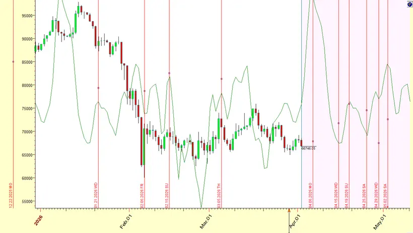
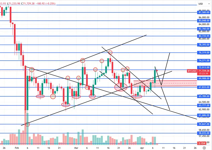
On the charts below, you are looking at a planetary cycle overlay mapped against Bitcoin price action.
The green line represents the cycle, while the vertical red lines mark key turning points derived from that cycle.

🔍 What You Should Notice
Across both charts:
The cycle does a very good job at identifying trend direction
Many of the major highs and lows align closely with the cycle peaks and troughs
You can see repeated behavior where:
Cycle tops → price highs or distribution zones
Cycle bottoms → price lows or accumulation zones
This is not random.
Markets tend to move in rhythmic patterns, and planetary cycles are one way to track that timing.
⚠️ Important Nuance (Very Important)
These cycles are not 100% directional tools.
Meaning:
If the cycle shows a high, price may:
Form a high
OR form a low (inverse reaction)
Sometimes price reacts:
Exactly on the date
Or slightly before/after
Or even lags behind the cycle
This is why we always combine:
👉 Time (cycles)👉 Price levels👉 Market structure
Cycle Behavior
You will also notice:
Certain periods where the cycle is very accurate
Other periods where it flips (inverse behavior)
Some moves where price front-runs the cycle
This is completely normal.
No single cycle works perfectly in isolation.
How to Use This
Use these charts as:
A directional guide
A timing reference
A way to identify potential pivot windows
But NOT as a standalone signal.
Key Takeaway
These planetary cycles:
✔️ Provide very good directional bias✔️ Help identify turning points❗ But must be interpreted correctly
Study the charts carefully.
Look how price reacts around the peaks and troughs.
Use it in combination with your own tools and rules, and adapt it in a way that fits your system.
More cycles and variations will be shared in future updates.
Bitcoin Astro


Comments